
Transliteration
Below, you will find four examples of Torah written in transliteration. These tools are meant to show you different ways of providing inclusive options for your students. I invite you to take a look at them and use their models to help you create transliteration Torah pages for your students.
Transliteration #1


This is what I call the "regular" option. The transliteration is written out clearly, with spacing between each syllable. It was important to have both the Hebrew and the translation readily available. However, most important, was to clearly have the trope underneath the transliteration mimicking the Hebrew.
Transliteration #2

This option is similar to the first option, however, it is written in the Open Dyslexic font. This font was created for people with dyslexia to read with more ease. This entire website is in the Open Dyslexic font.
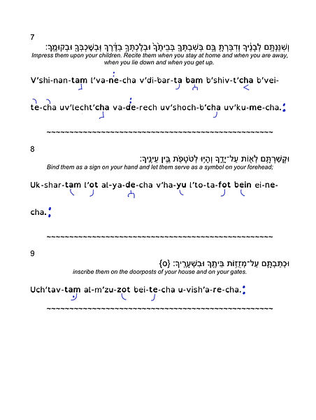
Transliteration #3


This color-coded system, unlike the previous one, has only the part of the word highlighted. This is to signify to learners that this is where the emphasis of the trope goes. This option may also be easier for students to read as there is less color on the page.
Transliteration #4
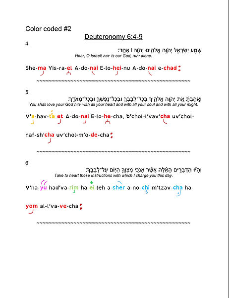

This option is similar to the third option, however, it uses less color and focuses on the emphasized syllable.
Trope Groupings


This is a list of all the trope groupings. For a color-coded system, I have organized them in rainbow order as a way to easily remember which color goes with which.